Why Choose Tempdrop?
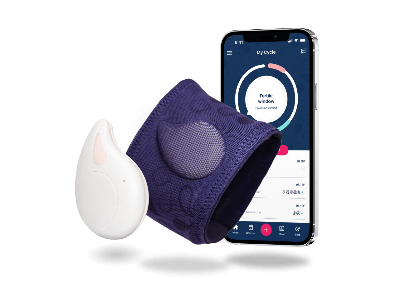
Tempdrop offers a personalized and convenient approach to fertility awareness. The Tempdrop device is worn on your upper arm, over your axillary artery, where it tracks your Basal Body Temperature while you sleep.
The device takes thousands of readings and uses its learning algorithm to identify your most accurate temperature reading for that sleep session, making it reliable even if you experience disturbed sleep or have an irregular sleep schedule.
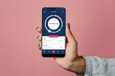
The Tempdrop app syncs to the device and makes it easy to to track all your fertility information in one place, including additional recommended biomarkers such as:
Cervical mucus
OPK test results
Cervical height
PMS symptoms
And more.
Why Track Basal Body Temperature?
Tracking your basal body temperature (BBT) is a cornerstone of fertility awareness because it provides critical insights into your menstrual cycle. Here's why it's so important:
1. Confirm Ovulation
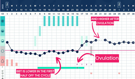
BBT is one of the clearest indicators that ovulation has occurred. After ovulation, the hormone progesterone causes a slight rise in your resting body temperature. By tracking this temperature shift, you can confirm ovulation and identify where you are in your cycle.
2. Identify Your Fertile Window
While BBT can’t predict ovulation in real time, combining it with other fertility signs, like cervical mucus and ovulation tests, can help pinpoint the time when it’s possible to get pregnant, and when it’s not.
3. Understand Your Cycle Health
BBT tracking gives you a window into how your hormones are functioning. Consistent patterns can show that you're ovulating regularly, while irregularities might highlight potential hormonal imbalances, such as anovulatory cycles and hormone imbalances.
4. Customize Your Family Planning
BBT tracking helps confirm when your body is most fertile, increasing your chances of pregnancy or enabling you to practice natural family planning effectively.
5. Monitor Pregnancy
If you're tracking BBT and notice sustained high temperatures past your typical luteal phase length, it can be an early sign of pregnancy. You can also track your complete pregnancy and get useful insights using your Tempdrop app.
7. Track Progress Through Hormonal Transitions
BBT is also useful during transitions like coming off hormonal birth control, postpartum, or perimenopause. It helps track the return of ovulation or changes in cycle regularity.
Tempdrop gives you precise, personalized insights into your cycle—helping you make informed decisions about your health and fertility.


